When designing a website or piece of media I many times work with clients who view white space as something that needs to be filled. Often, open space motivates a client to think “what can I put there?” It is easy for a design to get bogged down with unessential information if white space is not valued. In a proper design white space is just as important (if not more so) than the copy space. Here’s why…
Space gives the impression of quality
When looking for “cheap”, we mostly run to Wal-Mart, Target or The Dollar Store; where isles are so narrow and the shelves so packed full of goods we can barely maneuver our carts. But when we are looking for quality, we head to the mall where the stores are more spacious and elegant. Our senses “feel” quality from the second we walk through the doors. And, since we have made the decision to invest more money, there is a certain level of expectation. What makes the difference? Clutter!
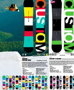
Take a look at the two publications below. Note how the use of white space lends to the feeling of “quality products” in the ad on the right.

Planned white space can activate a design
Used wisely, white space can make a design come to life. Centering all of the elements on a page causes the white space to “disappear” because it is too predictable. The problem is the design becomes predictable too! By creating a “passive” design you ensure that it will most likely not catch anyone’s eye.
Take a look at the two graphics below. In the graphic to your right not only does moving some of the elements off-center make the graphic more dynamic, the white space becomes more dynamic too.


White space is just as important as black space
Have you ever looked at a poster that displays an obvious image with another image hidden within it? At first the hidden image may be hard to see, but once you have seen it you wonder how you missed it to begin with. In the same way, white is sometimes hard to see. Even so, white is a color, just like black, and it adds value to a design. Do you see more white in the picture on your left or right? Which white is more dynamic? In either case, now that you are looking can you see the white?


White space can prevent a “bad acid trip”
A fear of white space often leads people to add too much color to a design. Empty spaces are turned into blocks of color, graphics are colored, and sometimes color is used excessively to make important pieces of text stand out. When visitors arrive on your home page for the first time, their eyes have a split second to decide where to land first. Too much color, bolding and capitalization causes the eye to become overwhelmed and move on. For a website owner this means a quick click away from your site. For others it may mean people passing right by your poster without any desire to read it.
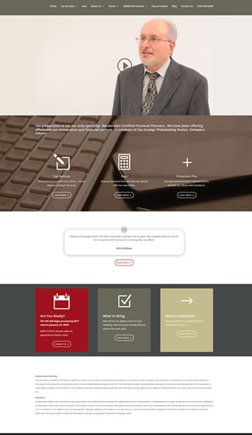
The examples below show how over-emphasizing can actually diminish the importance of your message. In the example on the left everything looks either important or unimportant, depending on your perspective. In the example on the right, the important parts of the message stand out quickly. Note how the white space has added value to the design – nothing has been wasted.

White space provides direction and keeps us connected
White space should be used like a traffic cop, directing eyes in the direction you want them to go. It is the glue that connects images with text and can be used to move the eyes up and down or left and right.
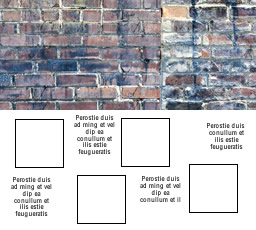
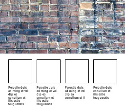
In the example on the left it is hard to know which way the eyes should move or what text goes with what image. In the example on the right, the image and description problem is solved and the evenly placed white space tells the eyes to move from left to right.
Space is soothing to the eye
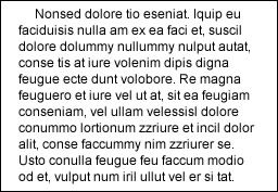
Since the eyes can only take so much strain, cramming too much text into too small of a space can cause eye fatigue. Website owners especially need to take this into consideration because the hard-to-read text is combined with the glare from a monitor. White to the rescue!! Take the same amount of text, add sufficient white space, and the problem has been solved.



0 Comments