Core Web Vitals Have Become… Vital!
Of course to us “Divi Lovers”, the theme is vital too.
Having been a web designer since 2000, I have experienced more than one major shift in the way Google ranks websites. I am proud to say that I never participated in any of the black hat optimization methods of the day, nor did I ever recommended them to a client as a quick fix. It made sense to me even in the 2000’s, that the only thing Google had to offer was relevant results and a good user experience. I warned my clients that sooner or later their competitors would pay the price by relying on link farming, keyword stuffing, and other black hat tricks.
I have to say, for several years I was starting to lose faith in Google. It was hard to watch websites breaking their standards over and over again, and still moving up the coveted first page. But as the years have passed, my “right thinking” has been validated. Google has steadily gone through “shifts” bent on weeding out the junk. Now, with the new Core Web Vitals metrics, quality and user experience mean everything! For Google, and for us web designers.
The Day the Earth Stood Still
What…just…happened.
Seeing as my whole design philosophy pivots on quality and search engine friendliness, I include “organic SEO” as part of my contract. Staying on top of SEO news is important to me to make sure I can always provide the best results for my clients. Often, I’ll experiment with my own website so I can continue to learn and grow. So I’ll never forget the day I hopped on GTMetrix to run a check-up on my site only see that my steady score of “A” had dropped to a “D”! Well, a challenge is a challenge. And I can’t offer a service I can’t deliver, so it was time to dig in.
Is it Divi’s Fault?
It’s no one’s fault
I’ve seen a lot of talk on my Facebook groups regarding Divi and some of the other backend builders like Elementor. In general, people are calling issues that are suddenly showing up “bugs”, or place the blame on the theme or builder. They are crap, and they are producing crap. (We know better, don’t we? 😉)
I think it is important to remember that the core web vitals are NEW. Cumulative layout shift (CLS), for instance, didn’t become a ranking factor until this year. How could older themes and backend builders plan for something that didn’t make a difference until now? Going forward, I believe you will see Divi providing a lot of updates that focus on solutions to the new ranking criteria. I still feel Divi offers the most feature rich builder around. The sad part is, if you want to target the 100% goal, you’ll need to cut back on some of the features, at least for now.
Is it Difficult to Pass Google’s New Ranking Criteria?
let me be brutally honest… yes.
In a recent article written by Digital Market Depot and posted on Search Engine Land, after conducting a comprehensive analysis, which included crawling 2 million url’s, they found that only 4% of websites passed all of the core web vitals. So, yes, it is difficult. Another complicating factor is that each website you design will require different strategies, especially when it comes to CLS. The trend for the past several years has been to use a lot of animation (too much in my opinion) to add excitement and energy to a website. Elements zooming in, fading out, etc. Divi makes the use of these elements easy and fun. But all of that shifting and movement can wreak havoc on your CLS score.
How Important is Passing in the First Place?
most of my websites are for small to medium business, so what’s the big deal?
Google’s John Mueller explains in his own words:
“My understanding is we see if it’s in the green and then that counts as it’s OK or not. So if it’s in yellow then that wouldn’t be in the green, but I don’t know what the final approach there will be.
There are a number of factors that come together and I think the general idea is if we can recognize that a page matches all of these criteria then we would like to use that appropriately in search ranking.
I don’t know what the approach would be where there are some things that are OK and some things that are not perfectly OK, like how that would balance out.”
So you’ll have to make the decision for yourself. Google is going to provide a ranking boost for websites that meet all of the criteria, so if you want to provide your clients with the best results you can organically, you’ll need to do the work. Also, even though it is still in discussion, Google is throwing around the idea of showing a badge in the search results for websites that meet or exceed all three metrics. Think of the opportunity for web designers. If you can master this new skill, you can include it in your services, maybe even a premium service. The badge is your proof!
I Am Not Giving Up!
At the time of this writing, and using my website as a guinea pig, I have managed to meet all of the core website vitals on desktop, and I am almost there for mobile.
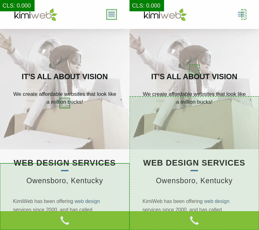
One of the problems I am facing on mobile is that the hamburger menu contributes to the CLS score because it expands when clicked. I will continue to research and work on my mobile score and will update this post when I have succeeded.
If you have additional ideas, resources, or found a solution for the hamburger menu, I’d LOVE to hear from you!
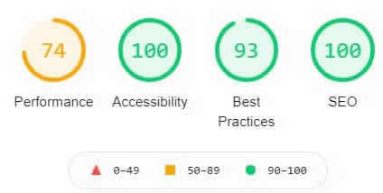
July 1, 2021
Desktop
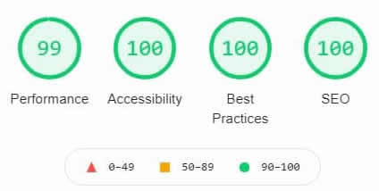
Mobile

Solutions I Used to Pass Core Web Vitals Using Divi
Here I will try to be as thorough as possible, but I worked on the score for several weeks and may have forgotten a thing or two. I will break down the tips and resources by the specific metric. If you have any questions, just let me know! You might jog my memory regarding something I left out.
Performance
I should mention I host on a Nginx server with server side caching and using HTTP/2. That gives me a head start!
Here’s what I did:
The items listed below helped with first contentful paint, speed index, largest contentful paint, time to interactive, and total blocking time. Since cumulative layout shift is so complicated I’ll list those steps next.
- Made sure all of my images were compressed and properly sized
- Cropped and further optimized background video in hero section
- Used a free CDN account at Cloudflare
- Removed as many plugins as possible
- Purchased Asset CleanUp Pro to unload unneeded assets from home page, etc.*
- Purchased RapidLoad Power-Up to remove unused CSS on the fly**
- Only used 2 fonts
- Installed OMGF plugin (free) to save fonts to server and remove external request
- Switched from Contact Form 7 to the Forminator plugin (free)
- Stopped using the Monarch plugin! and purchased Novashare***
*Although there is a bit of a learning curve, Asset CleanUp Pro was one of my most powerful tools. Using this plugin, I could unload, async, defer, and move from <HEAD> to <BODY>, CSS & JavaScript from Plugins, Themes, Uploads Directory, WordPress Core, external 3rd party, and hardcoded styles and scripts. I could do this on a per page base or globally. It is even possible to keep CSS/JS on desktop, but not on mobile and visa versa. Using other global settings I was able to minify and combine + defer both CSS and Javascript as needed. Google fonts can be combined, preconnected or preloaded as well. For $49, this was a great investment.
**RapidLoader Power-Up worked wonders for my site speed by removing unnecessary CSS content from my CSS files. It reduced the size of the CSS file loading on my home page from 1.69MB to 608.84KB. That’s a 64.89% savings! Once queuing starts, the plugin automatically finds and optimizes the CSS on all of the pages on your website. You can see the real time savings at Google Page Speed Insights from the backend settings. Support is super helpful as well. $69/year works out to $5.83 per month. It was well worth it!
***I was pulling my hair out over the Monarch plugin. Not only does it come with it’s own stylesheet, it installs on every page of your website even if you only use it on blog posts. It was really effecting my load time. The CSS and JavaScript load in the <HEAD> of the website. Using Asset CleanUp I tried moving the script and CSS to the body and it broke the home page. After I removed the plugin my load time improved noticeably. Next, I tried to other free, popular sharing plugins and both cause issues with performance. One pulled in assets from facebook & who wants to wait around for that to load!
I found Novashare, and I am so happy I did! Scripts don’t run where they shouldn’t, it uses inline SVG icons with clean code, custom tables reduce bloat, and it is lightweight! Under 5 KB on the front-end. I was stuck at 98% for performance before switching to Novashare. Afterwards I jumped up to 99%! It also offers some really cool features and can be used with shortcode. It worked in my custom post template in the Divi theme builder. Only $29.95!
Note: I only used premium plugins to help with the performance metric. All other metrics were met using free plugins. But for a total of less than $150, I feel the premium plugins were worth it. Hopefully one day they won’t be needed, but the whole WordPress platform may have to be updated before that happens. Going forward with my clients, now that I know the plugins work well, I should be able to save purchasing unlimited licenses and adding the cost to my packages.
Cumultive Layout Shift
Sometimes it can be extremely hard to find a CLS shift. In the developer console they may show you a hero section or a section close to the top as the problem, when the shift is actually coming from an animation in the menu above. I found this free tool invaluable when it came to displaying where the CLS shift was originating: https://defaced.dev/tools/layout-shift-gif-generator/
Here’s what I did:
- The Divi theme builder global header caused almost insurmountable CLS shifts and flashing. After screwing around with the header for hours, removing all padding and using “transform”, and anything else I could think of, I gave up. And we are talking about a simple header with a logo one side and the menu on the other. I reverted to the default header and the shift dropped drastically.
- After reverting to the default header, I found that a shift is still picked up using the default menu where the logo is on the left and menu on the right. I chose the centered logo and the shift score dropped again. I set the both the primary menu and fixed menu to the same height and the score dropped again. But I still had to deal with the menu’s built in animation.
- This was sad for me, but I did away with all of the animation on the website. I wasn’t using a ton to begin with though. You can accomplish this with:
/* Stop all animation */
.et_pb_section,.et_pb_section
*{animation: none !important;
}
- Another issue was the Divi “jumping header” that is caused by the style sheet loading first, and then followed by the inline CSS afterwards. I saw a solution via CSS on so many websites, but for some reason it didn’t work for me. The easiest solution (which also helped with first contentful paint as well) was to use a pre-loader on the home page and the score passed.
- I went back through several of the sections and rows above the fold and removed some of the padding. I believe this is when I passed the CLS metric.
Note: I read on more than one website that moving your custom CSS into the head section of Divi | Options | Integrations helped with load time. When I tried that (and my custom CSS is minimal) the header started flashing. I can’t recommend this method for CLS reasons, but you can give it a try!
Accessibility
Fixing accessibility issues will be different for every web design since it depends so heavily on colors and the elements used. I highly recommend using a plugin to help you sort out issues.
Here’s what I did:
- Made sure all of my images used in the image module had alt text and titles. (Image Settings | Advanced | Attributes. Background image alt and titles were added via the media library.
- Installed WP Accessibility Tools to find and fix any areas where my website was not compliant (Free).
- Updated my website color palette to fix contrast issues
- Installed the Divi Accessible plugin which cannot be found in the WordPress Repository. The plugin can be found here. While there are many great plugins dealing with improving WordPress theme accessibility, this was developed for issues specifically found within Divi. This plugin helped bring my score to 100%.
- Fixed all content where the header hierarchy was out of order. Ex: <H1> <H2><H1>. Using header tags for styling purposes is a bad habit to get into. While Google has said they don’t put too much value into heading order for that very reason, screen readers rely heavily on them.
Best Practices
Here’s what I did:
- A common issue under Trust and Safety is:
“Links to cross-origin destinations are unsafe. Add `rel=”noopener”` or `rel=”noreferrer”` to any external links to improve performance and prevent security vulnerabilities.”
I ran into issues here when the external link was generated by a button and also the social follow icons. I solved this by installing the free plugin External Links – nofollow, noopener & new wind.
- I had a browser error logged in the console, so I found and fixed it! That seems simple, but it had a big impact.
- All buttons on my website that read “learn more” or “read more” failed due to: “links do not have a discernable name. I changed “read more” to “read full post”. I had to be more creative for the “learn more buttons”. Example “Learn More” for one element became “Learn more about our web designs”. Also make sure any linking images have alt tags. Note: This will also effect your accessibility score.
SEO
Here’s what I did:
- Used Yoast SEO plugin to add custom meta titles and descriptions
Note: Using the Yoast plugin did not give me a perfect score. However, fixing the issues under accessibility and best practices, combined with the plugin, gave me a perfect score.



Good read! Thanks for all the tips and tricks!
If you come up with anything else, let me know!
Really great tips and detailed analysis. I’ve found many of these same items to work for me on my Divi sites as well.
Thanks Joe!
Thank you for this. It really helped me. After reading this, I ran my website thru’ Google Page Speed and on mobile, I saw that it loads scripts from Moat and Bing Ads. Where does this come from and how do I stop this?
Do you by any chance use the “AddThis” sharing buttons?
You have documented a lot of work here for our benefit.
Thank you for helping with what you have found!
Amazing read, would love it if you found the time to update it as the same issues are still relevant, thanks for the great piece on divi!
I was just thinking the same thing yesterday! I am developing a website for an educational facility that required a deep dive in accessibility, which is an important part of vitals. I’d love to write down what I learned and I also managed to find a solution for the CLS caused by the Divi menu.